 Control Plane
Shared package
#Summary cards
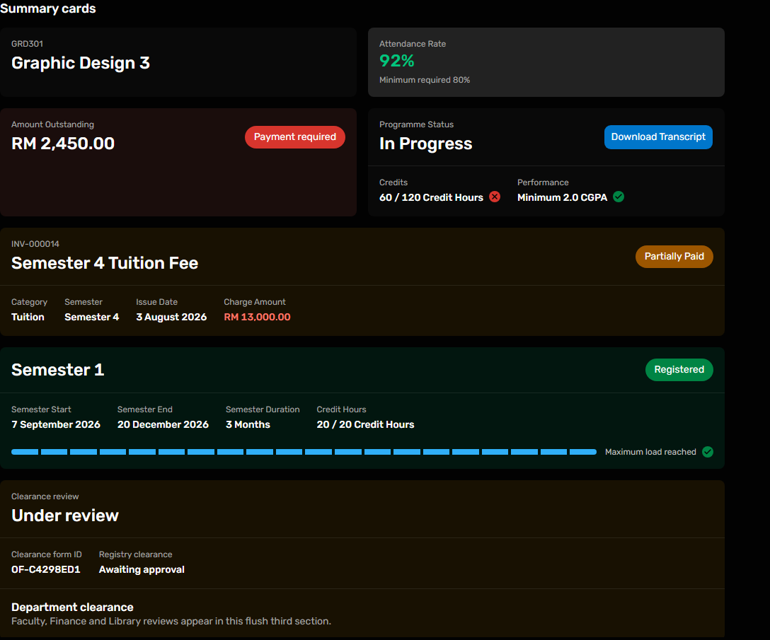
Shows identity, metrics, actions, columns, supporting content and a footer.

@raisd-campus/design-system/system/summary-card · Versioned catalogue
Design system · released package 0.6.2
Reusable page, card, table, media and feedback layouts
Static captures use mock portal data. Click a preview to inspect it at full size. Exact props come from the released package declarations or the owning portal source.
Shows identity, metrics, actions, columns, supporting content and a footer.
@raisd-campus/design-system/system/summary-card · Versioned catalogue
Use the component for this visual pattern; the consumer supplies data and workflow decisions.
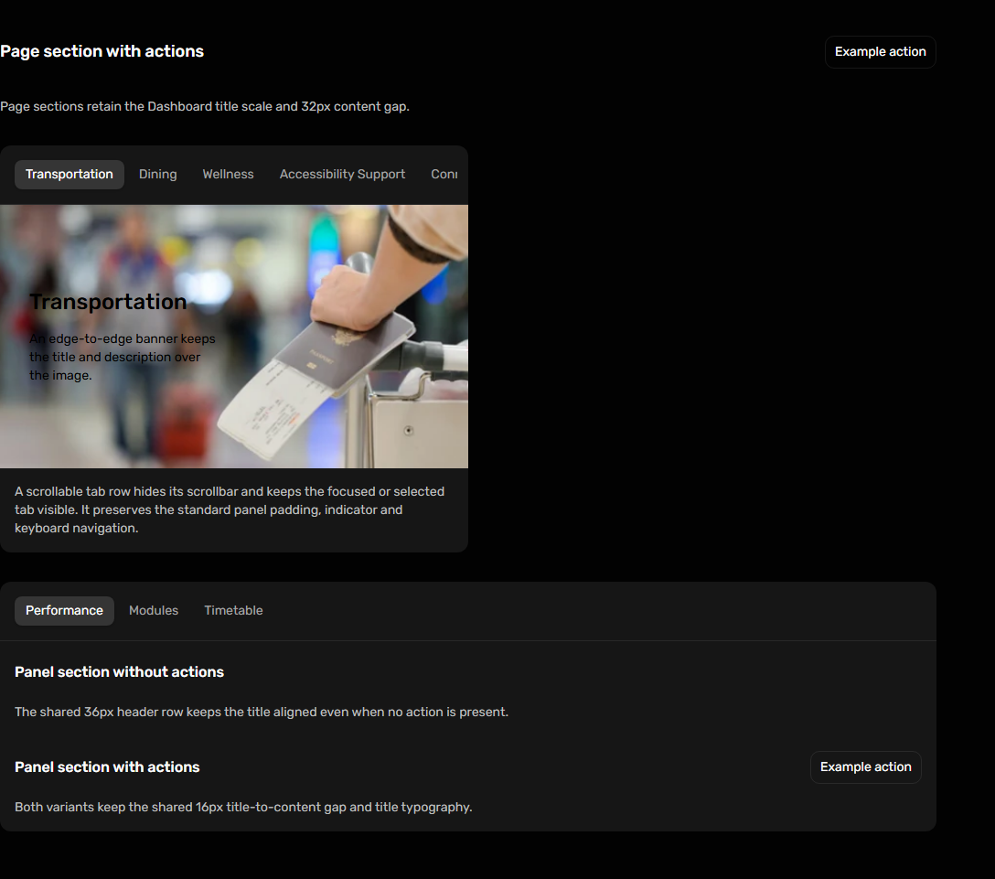
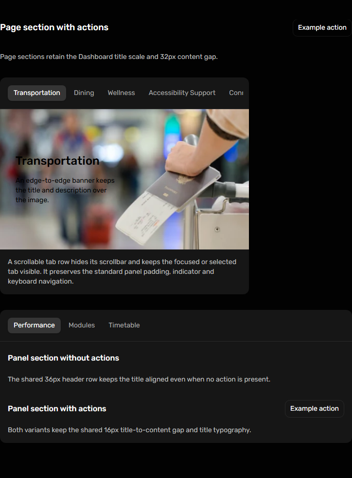
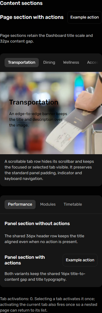
@raisd-campus/design-system/system/content-section @raisd-campus/design-system/system/page-panel-layout @raisd-campus/design-system/system/tabbed-page-panel · Versioned catalogue
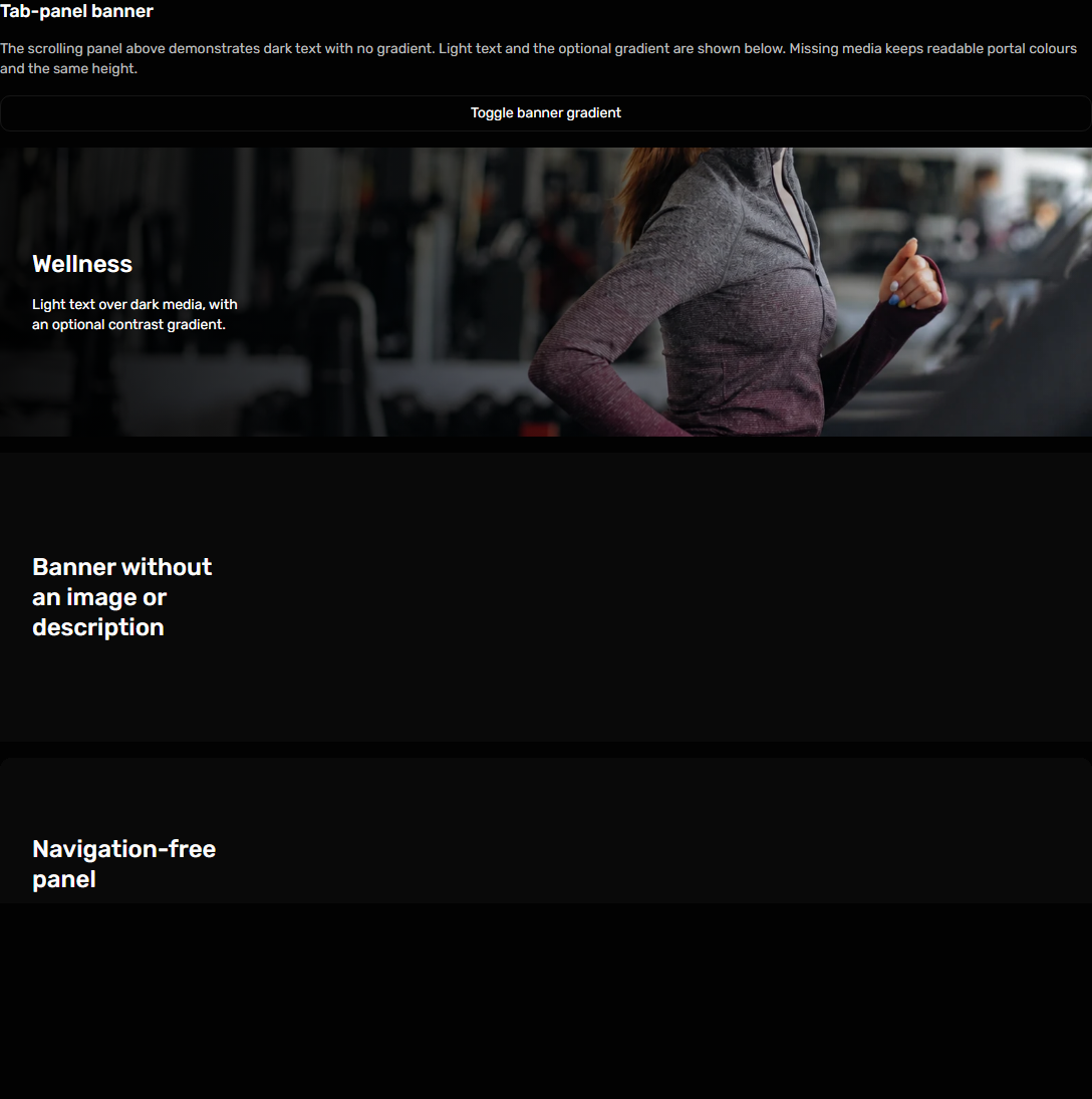
Shows media, missing-media and gradient treatments within the shared panel.
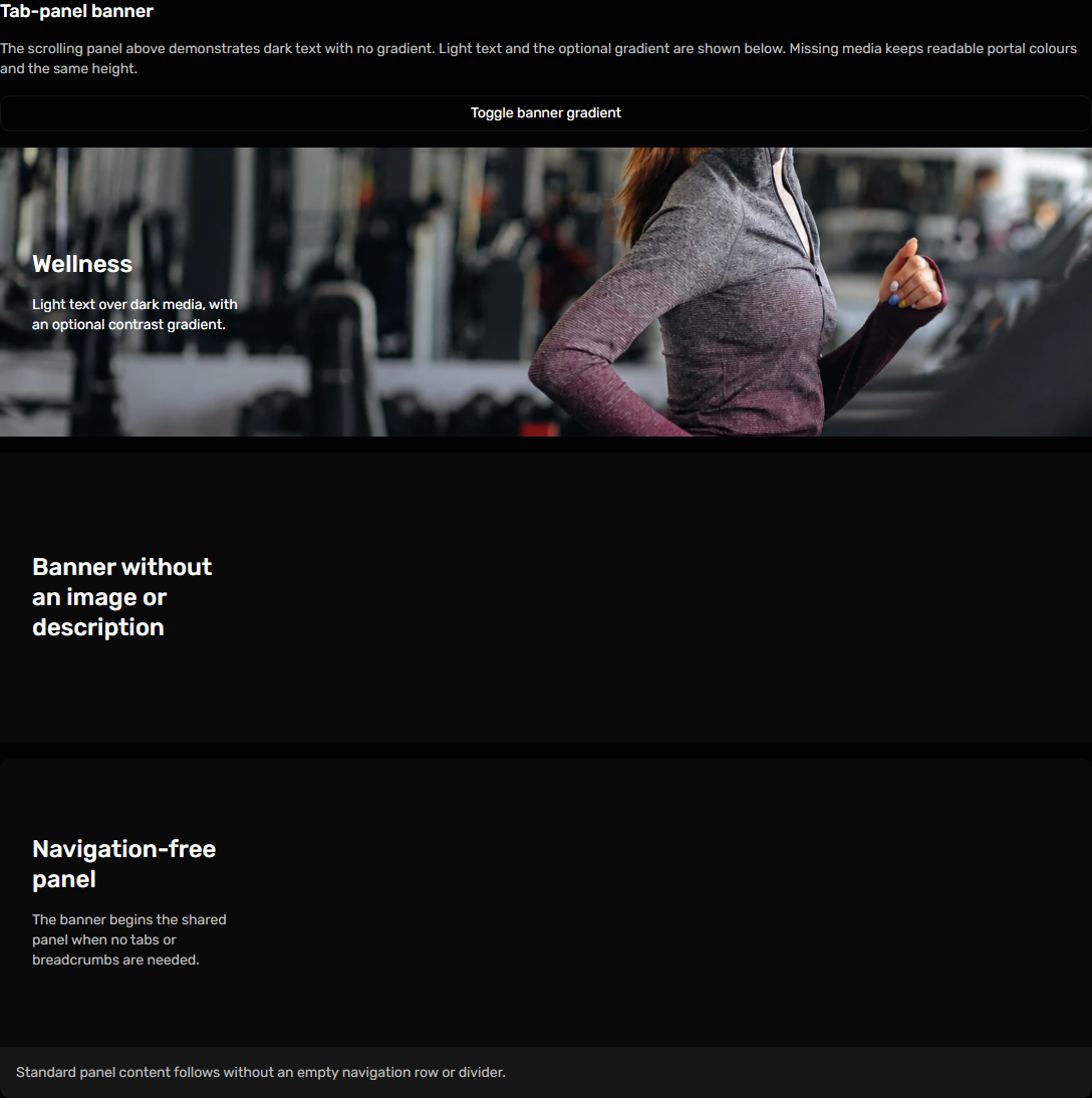
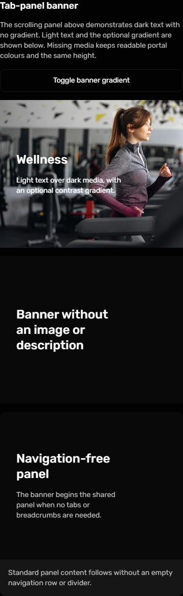
@raisd-campus/design-system/system/tabbed-page-panel-banner · Versioned catalogue
Use the component for this visual pattern; the consumer supplies data and workflow decisions.
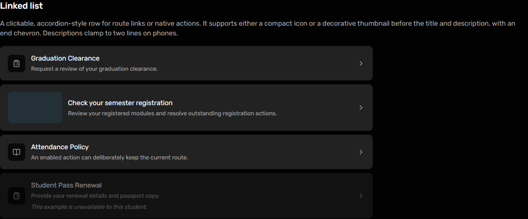
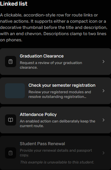
@raisd-campus/design-system/system/linked-list · Versioned catalogue
Use the component for this visual pattern; the consumer supplies data and workflow decisions.

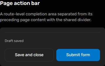
@raisd-campus/design-system/system/page-action-bar · Versioned catalogue
Use the component for this visual pattern; the consumer supplies data and workflow decisions.

@raisd-campus/design-system/system/inner-section · Versioned catalogue
Use compact cards for record lists and a scrollable semantic table for comparisons.
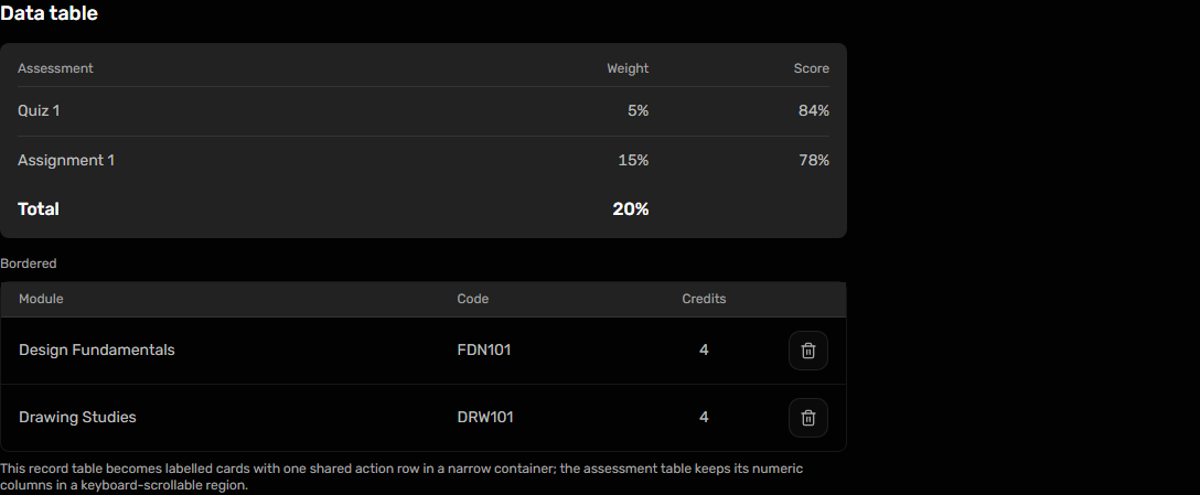
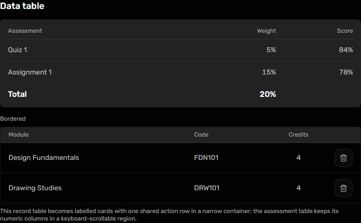
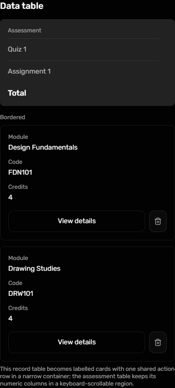
@raisd-campus/design-system/system/data-table · Versioned catalogue
Use editableUndivided for editable rows without dividers and with tighter vertical spacing; labels stack above controls in narrow panels. Optional tooltips stay beside the final word of a wrapped label and can be disabled. The standard variants retain row dividers.
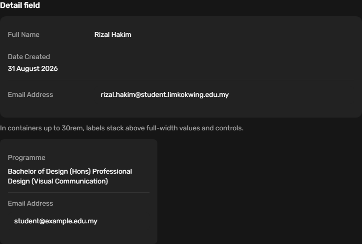
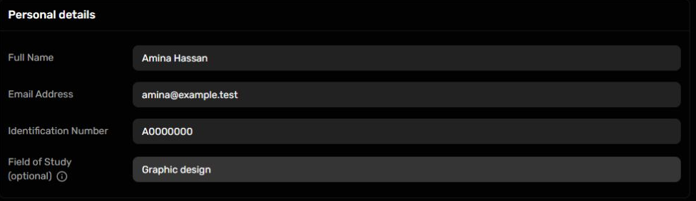
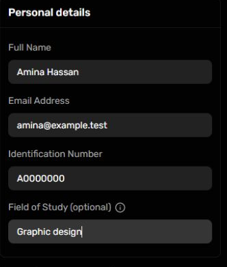
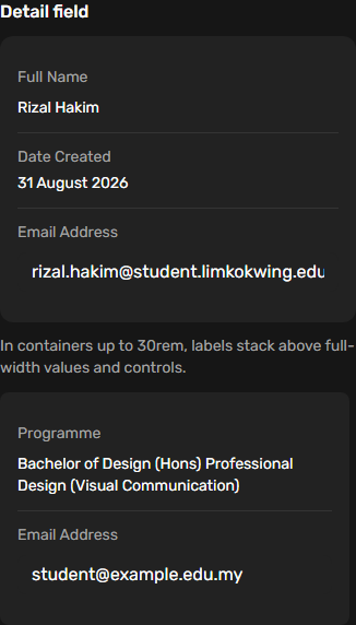
@raisd-campus/design-system/system/detail-field · Versioned catalogue
Use the component for this visual pattern; the consumer supplies data and workflow decisions.
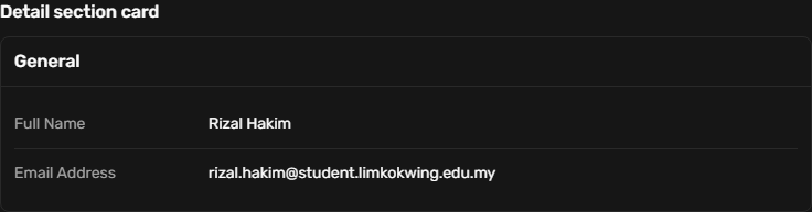
@raisd-campus/design-system/system/detail-section-card · Versioned catalogue
Use the component for this visual pattern; the consumer supplies data and workflow decisions.
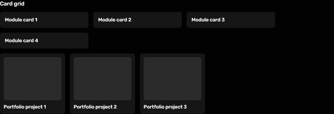
@raisd-campus/design-system/system/card-grid · Versioned catalogue
Use the component for this visual pattern; the consumer supplies data and workflow decisions.

@raisd-campus/design-system/system/issue-card · Versioned catalogue
Use the component for this visual pattern; the consumer supplies data and workflow decisions.

@raisd-campus/design-system/system/query-error-state · Versioned catalogue
One shared sidebar and header family across portals. The phone drawer, tablet rail, desktop frame, account avatar, page gutters and stable main scrollbar gutter come from the package; each portal supplies its own routes and account actions.
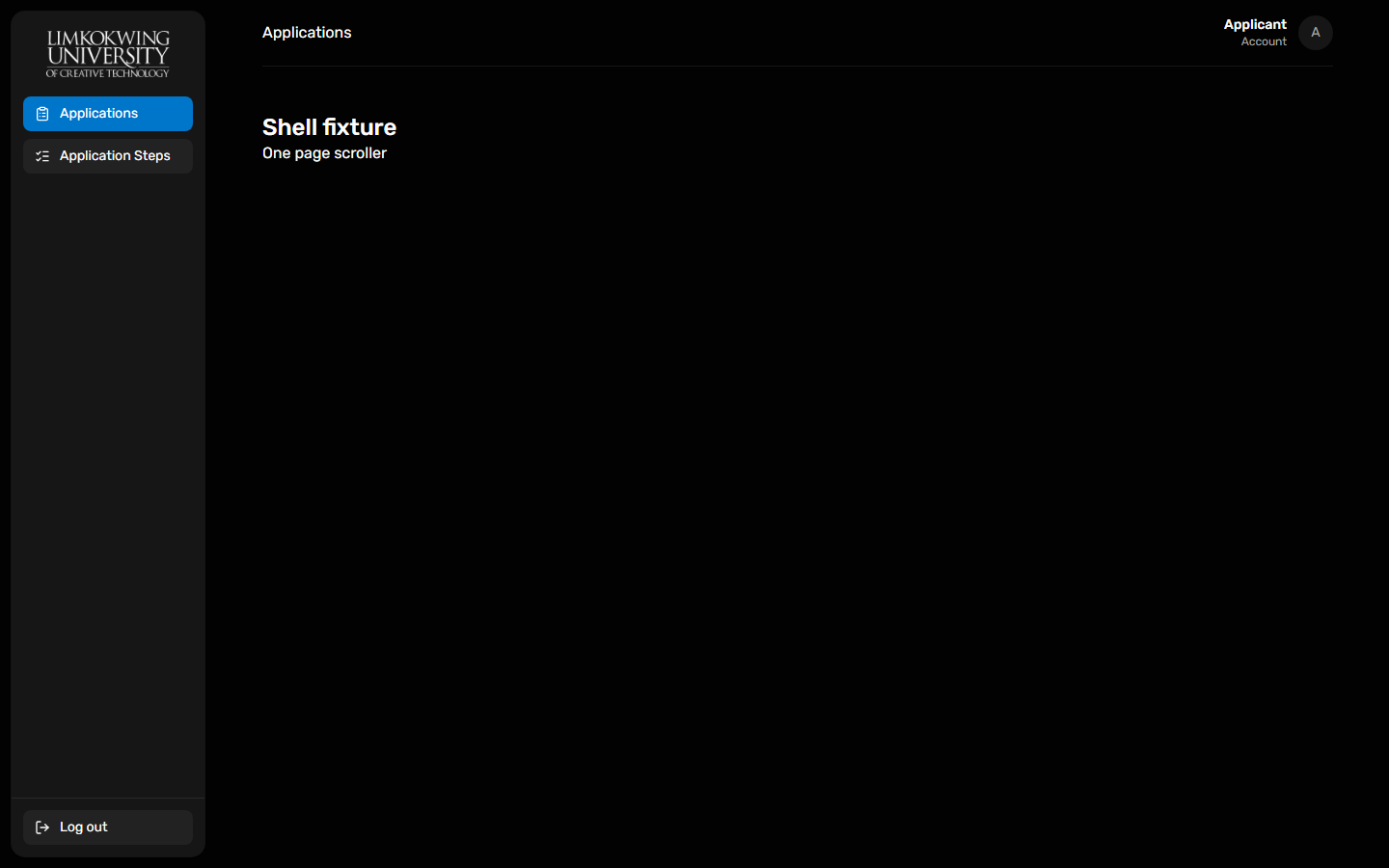
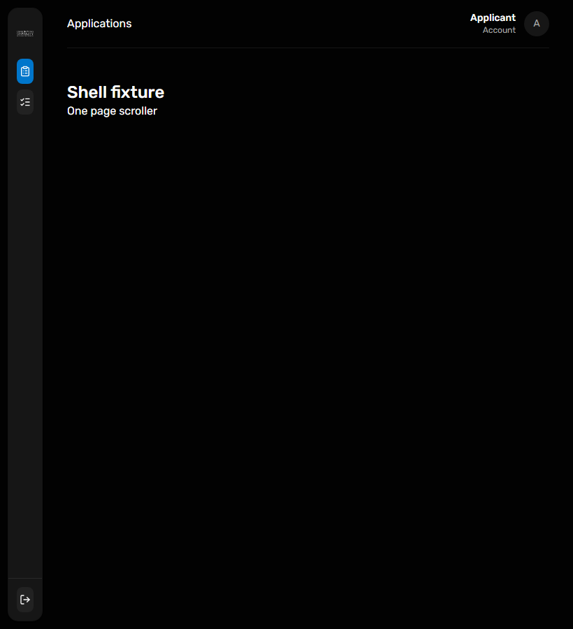
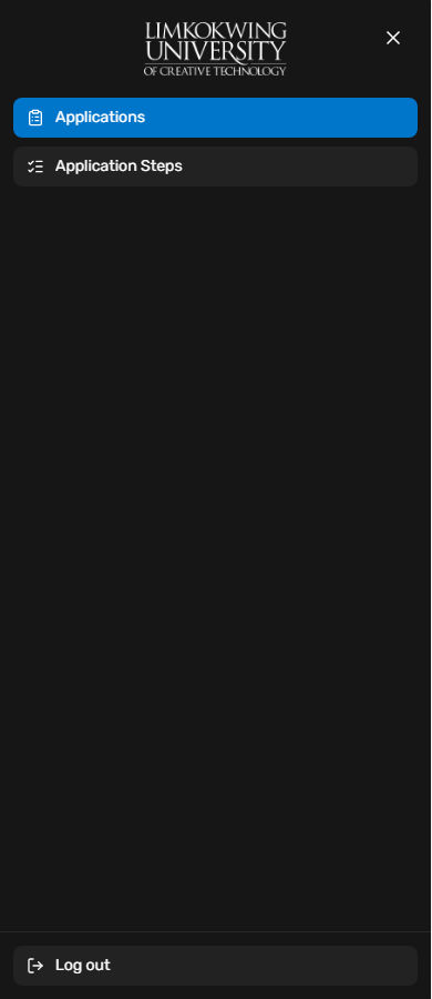
@raisd-campus/design-system/system/portal-shell · Versioned catalogue
Shows the reference as a labelled value above evenly spaced record fields, with clear space below the reference divider and a full-width status footer. The consumer owns labels, dates, status meaning and navigation.

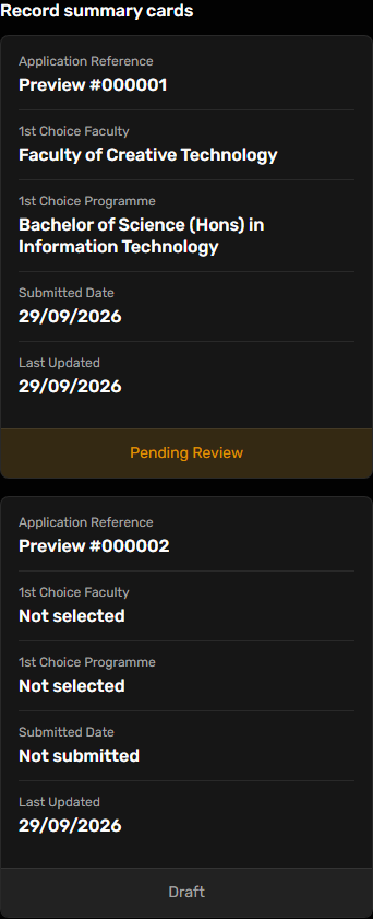
@raisd-campus/design-system/system/record-summary-card · Versioned catalogue
One large question at a time with responsive headings, 14px answer labels, controlled radio choices, keyboard focus, progress and action slots. Portals supply questions, branching, answer retention and navigation; standard-sized dropdowns can also fill the answer slot.
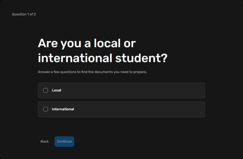
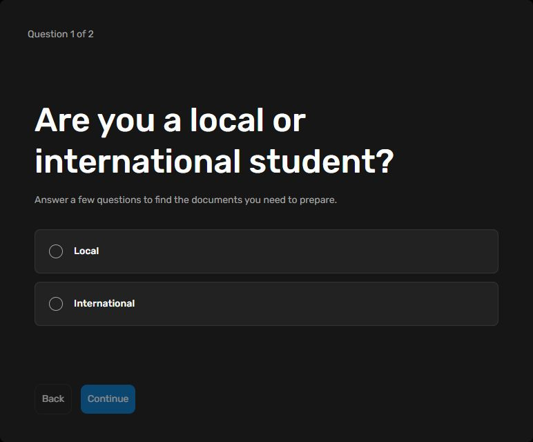
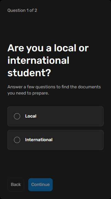
@raisd-campus/design-system/system/survey-layout · Versioned catalogue
A responsive page frame that fills its containing width, including with one tab and short content. The portal supplies tabs and content; route-level actions use PageActionBar.


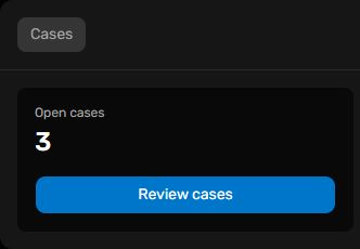
@raisd-campus/design-system/system/tabbed-page-panel · Versioned catalogue
Shared message rows, date dividers, attachment metadata, image previews and a controlled composer preserve Student's existing presentation. Portals own drafts, sending, validation, preview resources, unread tracking and workflow decisions. Chat avatar fallbacks use the darker surface-subtle token on the conversation surface. Enter sends and Shift+Enter adds a line; optional delete and receipt presentation requires consumer callbacks.
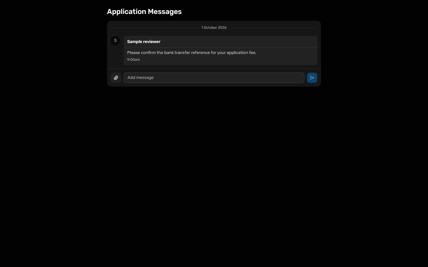
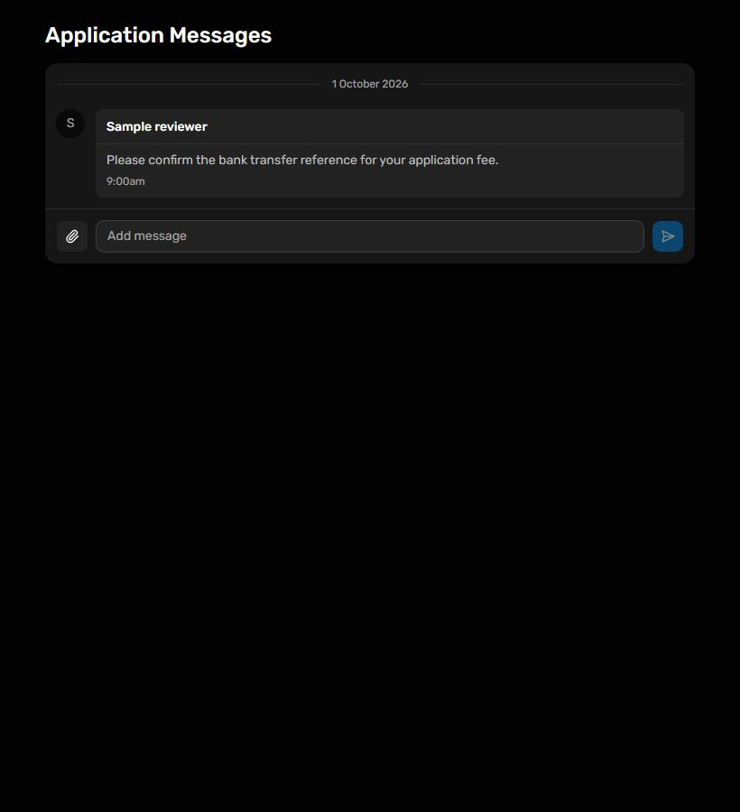
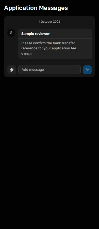
@raisd-campus/design-system/system/chat-message @raisd-campus/design-system/system/chat-composer · Versioned catalogue
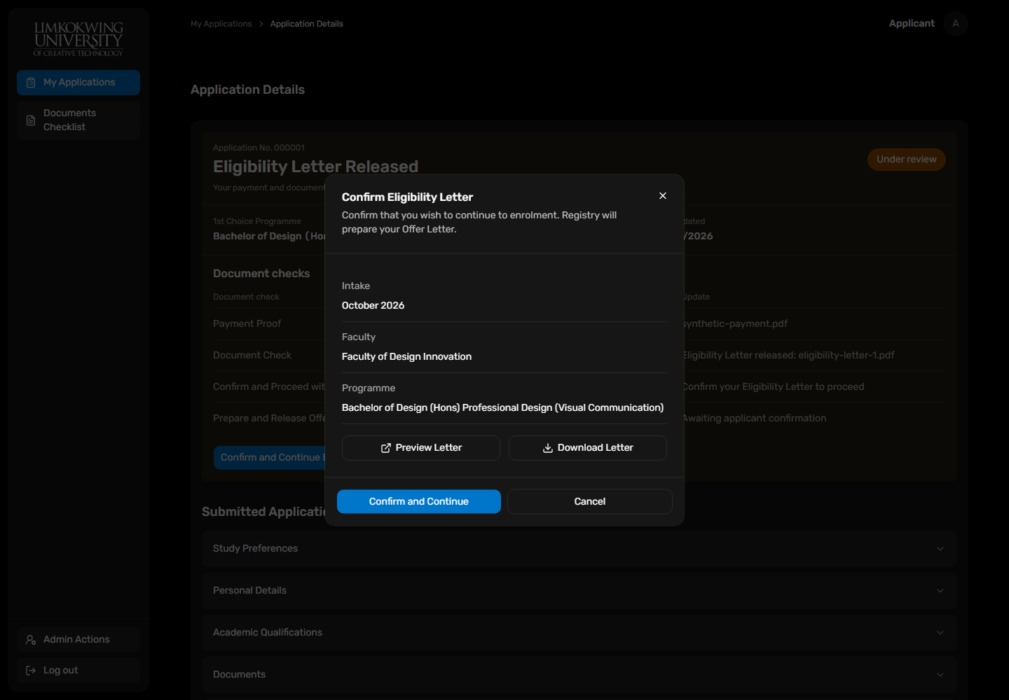
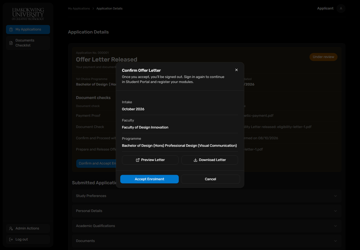
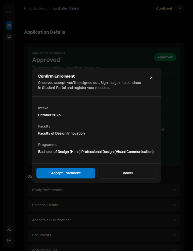
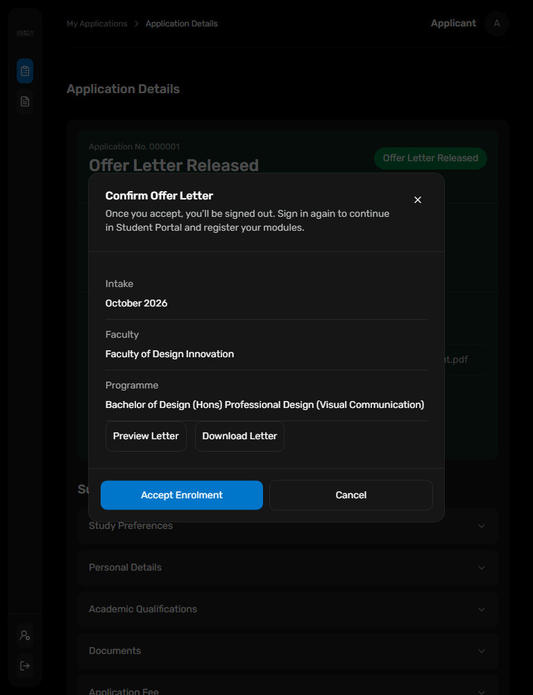
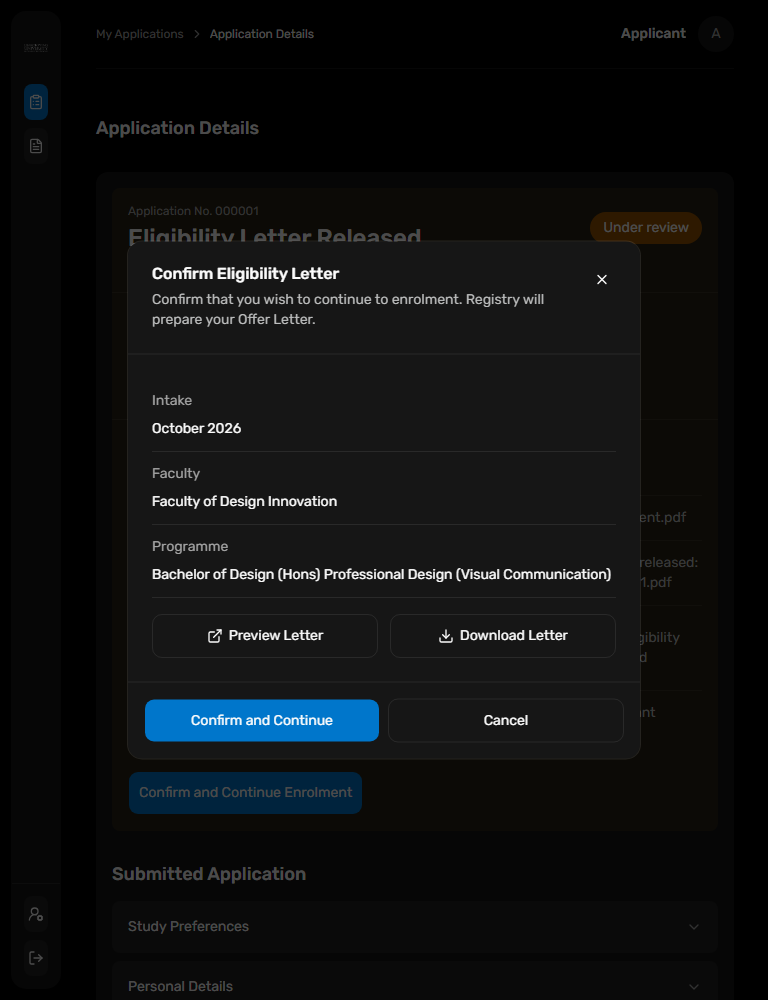
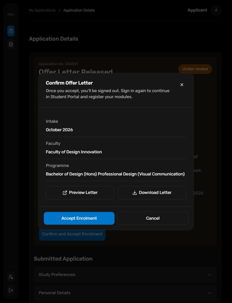
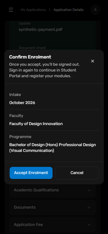
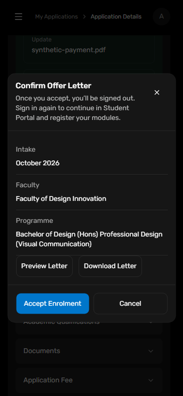
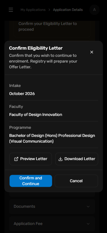
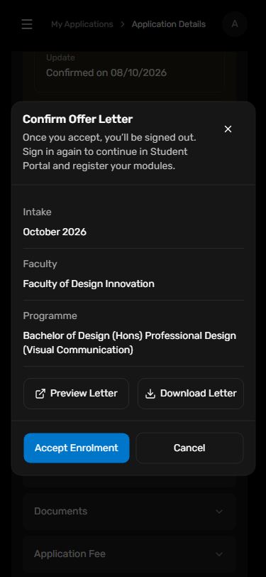
Historical 0.6.1 captures retain the earlier single-confirmation flow. New 0.6.2 v2 captures show QA Eligibility confirmation followed by Registry Offer acceptance, with spaced equal-width icon actions, native PDF preview in a new tab and filename-preserving download. Overall review remains orange until final acceptance; four checks separately track payment, documents, applicant confirmation and Registry Offer release. Applicant owns approved-enrolment acceptance and the development next-login workflow. This composition uses the released 0.6.1 Popup, DetailField and buttons unchanged; confirmation displays intake, faculty and programme and explains automatic logout followed by an explicit Sign in click. Failed logout keeps accepted status and retries only logout. Captures are from an uncommitted Applicant working tree, not a new package release or live authentication.
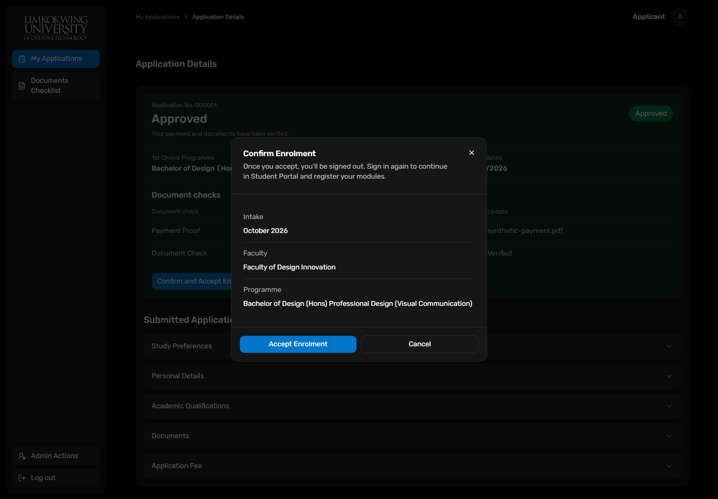
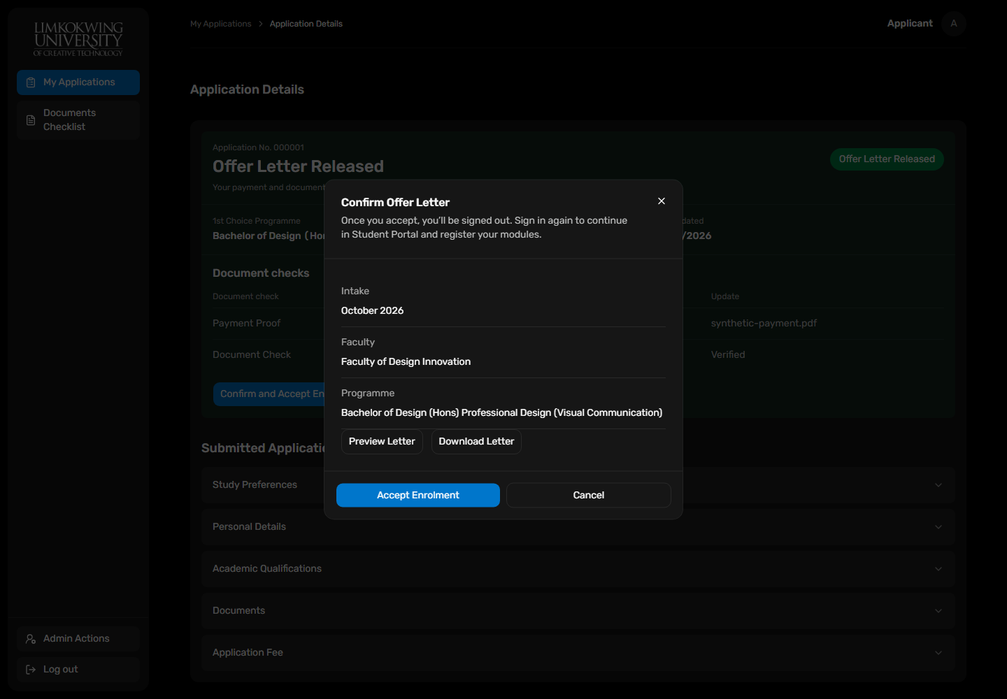
Applicant guidance · @raisd-campus/design-system/system/popup
Edit Answers and Create Application use equal-width columns at every viewport through the existing PageActionBar action slot. Applicant owns navigation and saved checklist state; released 0.6.1 buttons and page actions remain unchanged. Captures are from uncommitted Applicant source.



Applicant guidance · @raisd-campus/design-system/system/popup
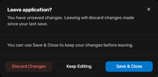
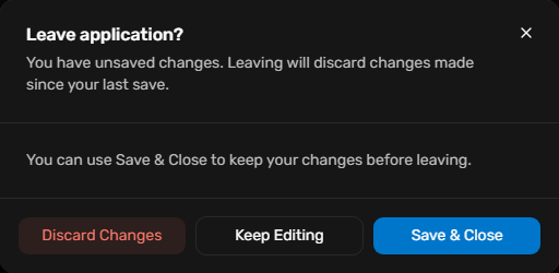
Released 0.6.2 Popup adds footerAfterDismiss for a consumer-owned primary action after standard dismissal. Applicant saves incomplete drafts before the originally blocked navigation, locks pending dismissal and keeps fields/files on failed save. Visual and keyboard order is Discard Changes, Keep Editing, Save & Close; the last action wraps on phone. Workflow belongs to Applicant and introduces no HTTP persistence.
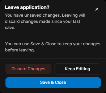
Applicant guidance · @raisd-campus/design-system/system/popup
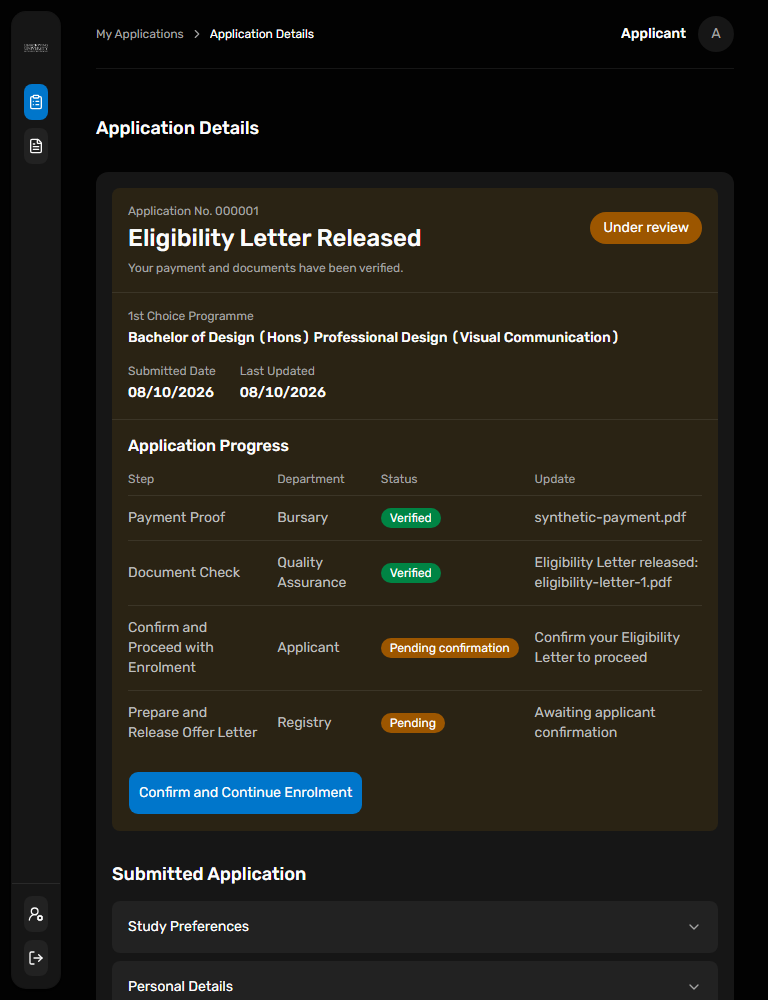
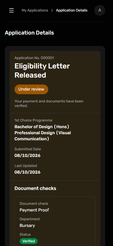
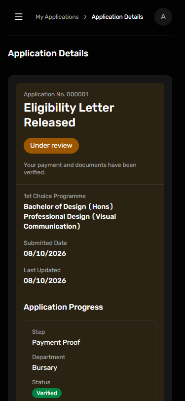
Application Progress uses Step as its first column. The orange Under review summary remains open through Eligibility confirmation and Registry Offer release. Four ordered rows independently report Bursary payment, Quality Assurance documents, applicant confirmation and Registry preparation/release. Only final Enrolment Accepted completes the overall review. These are uncommitted Applicant composition captures using shared 0.6.2, not new hosted operations.
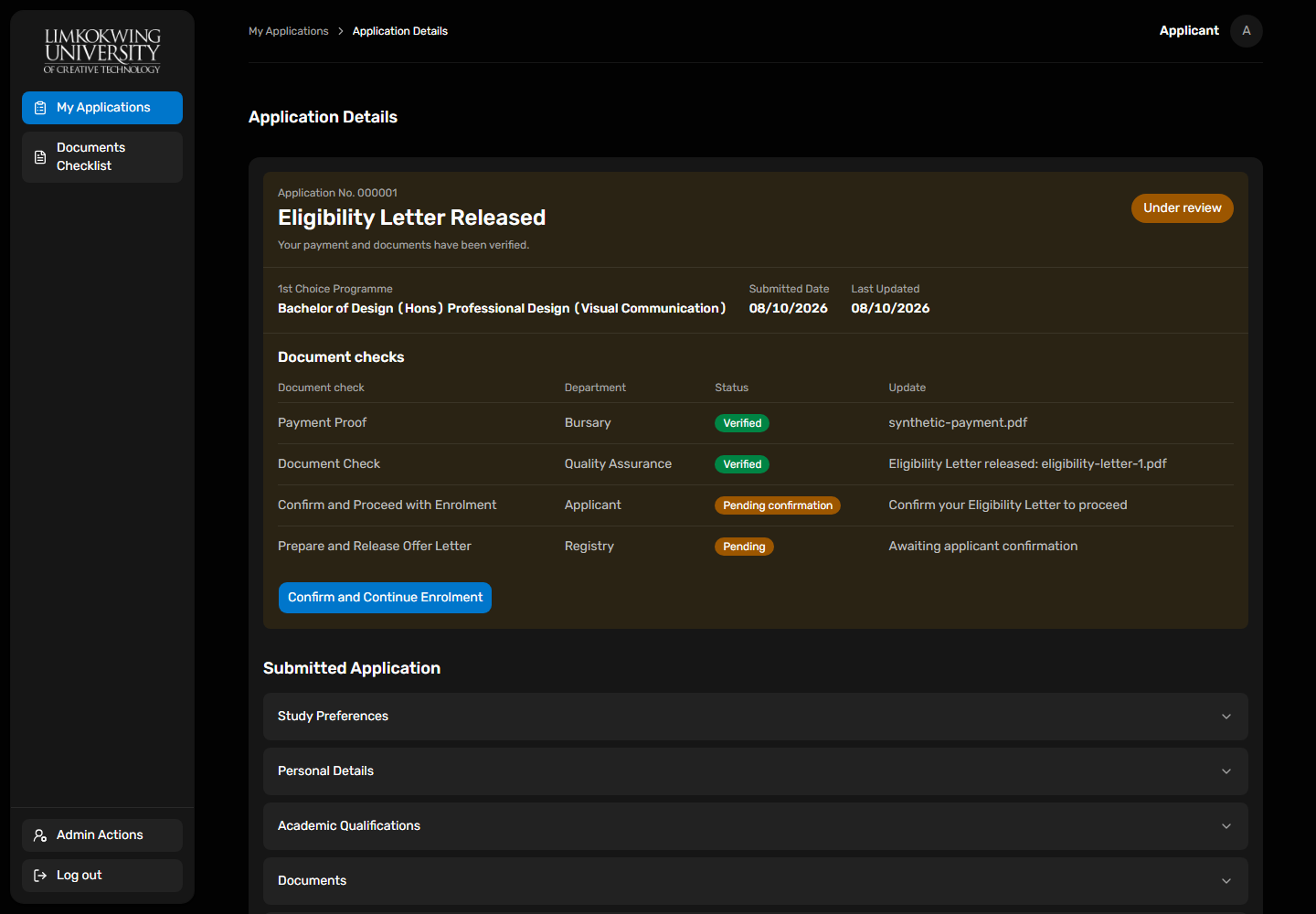
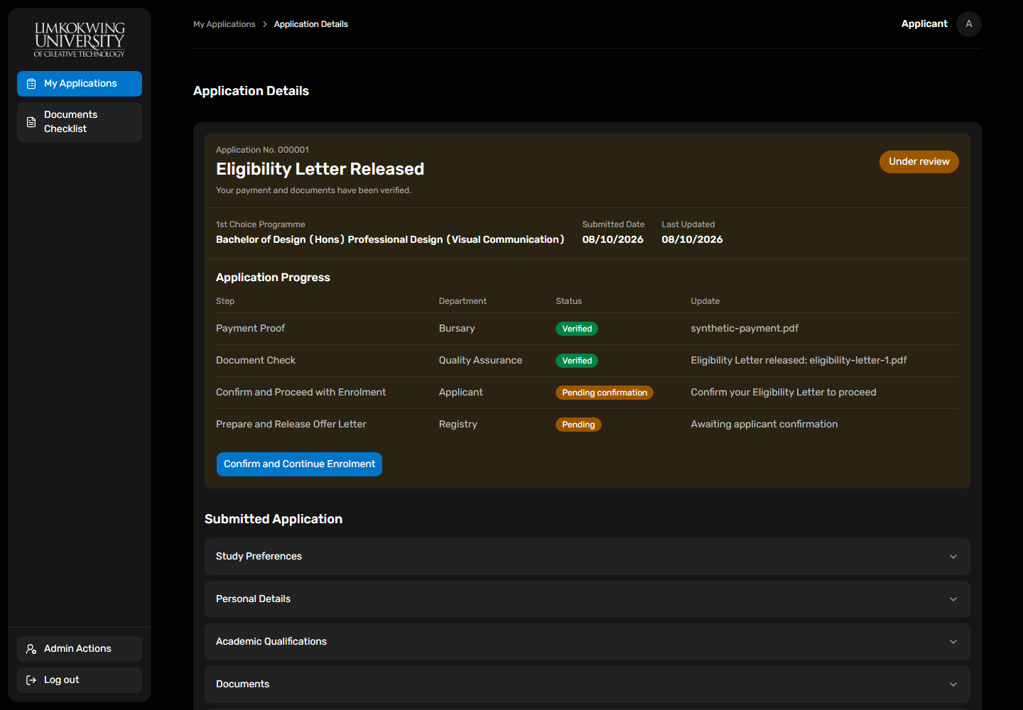
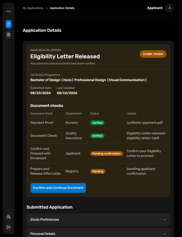
Applicant guidance · @raisd-campus/design-system/system/popup