Design system · released package 0.6.2

Foundations

Tokens, typography, colour roles and scrolling

Static captures use mock portal data. Click a preview to inspect it at full size. Exact props come from the released package declarations or the owning portal source.

Shared foundation

Surface tiers

#

Use the neutral elevation scale; the application canvas is tier zero.
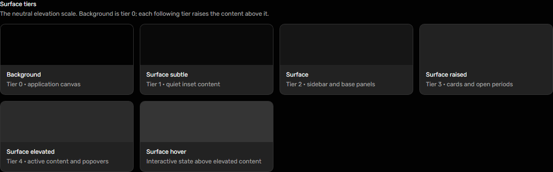
Dark portal UI: Surface tiers at desktop width
Desktop · 1440px · package 0.1.0

Canonical token guidance

Shared foundation

Brand palette

#

Use brand colours for hierarchy, not for success or failure.

Dark portal UI: Brand palette at desktop width
Desktop · 1440px · package 0.1.0

Canonical token guidance

Shared foundation

Global roles

#

Feedback colours carry meaning alongside visible text and icons.
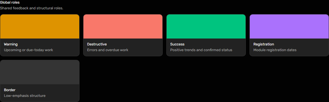
Dark portal UI: Global roles at desktop width
Desktop · 1440px · package 0.1.0

Canonical token guidance

Shared foundation

Service identity colours

#

These accents identify named services and are not status colours.

Dark portal UI: Service identity colours at desktop width
Desktop · 1440px · package 0.1.0

Canonical token guidance

Shared foundation

Typography colours

#

Use semantic title, body and muted text roles.

Dark portal UI: Typography colours at desktop width
Desktop · 1440px · package 0.1.0

Canonical token guidance

Shared foundation

Scrollbar

#

Keep scrollable areas usable with keyboard, pointer and touch input.

Dark portal UI: Scrollbar at desktop width
Desktop · 1440px · package 0.1.0
Dark portal UI: Scrollbar at desktop width
Desktop · 1440px · package 0.1.0

Canonical token guidance

Shared foundation

Typography

#

Use the shared type utilities to preserve the portal hierarchy.
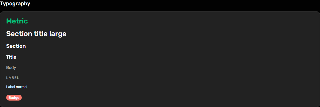
Dark portal UI: Typography at desktop width
Desktop · 1440px · package 0.1.0

Canonical token guidance
